


Why Your Healthcare Dashboard Isn’t Working And What to Do

Related articles:
Unlock Growth with TempDev’s Appointment Analysis Power BI Dashboard
Read ArticleUse TempDev’s NextGen Order Management BI Dashboard to Drive Clinical Insights
Read ArticleUtilize NextGen EHR Operations BI Dashboard to Improve Clinical Workflows
Read Article
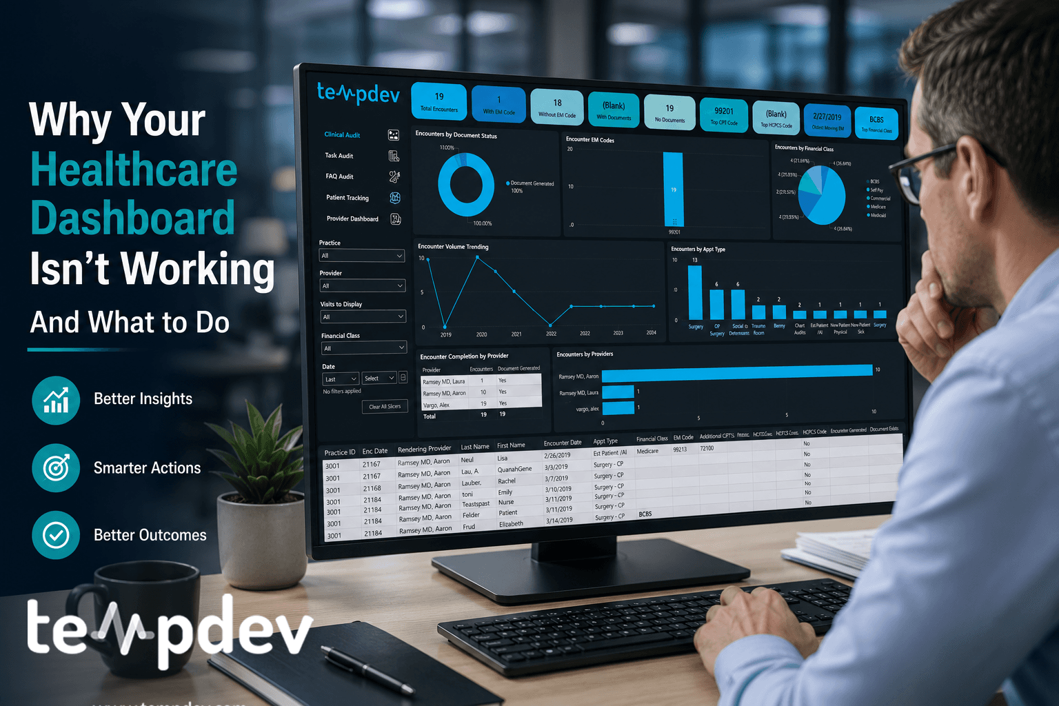
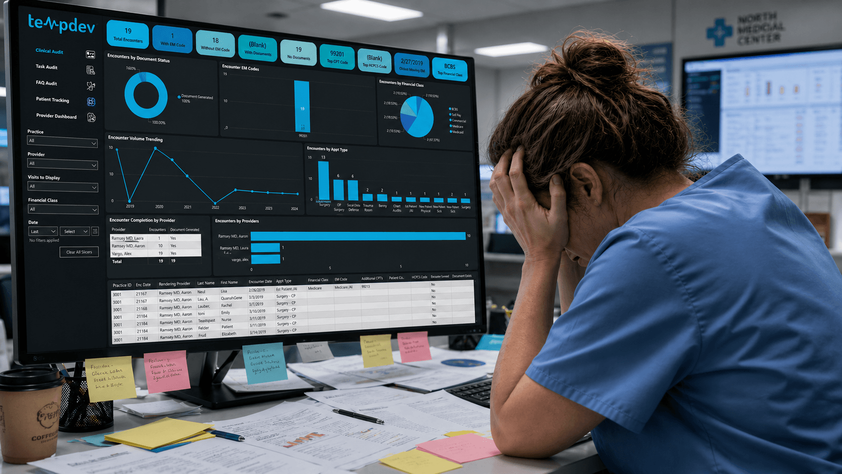
There is something almost magical about a good healthcare dashboard demo. Clean graphs, pretty color tile, good design: everything looks promising. And then three months go by, and nobody’s using it.
That story is more common than most healthcare organizations would like to admit. Healthcare BI dashboards often look impressive before crashing with real workflows. And it’s more a design and healthcare analytics strategy problem than it is a technology one.
The Problem With "Pretty" Dashboard
Most organizations will prioritize visuals over function then wonder why their dashboard isn't driving decisions or actions.
Too many metrics displayed at once is also a most frequent reason we see healthcare dashboards failing. If a revenue cycle leader reviews 40 metrics at the same time, they'll have no better understanding of what's going on than they would've reviewing all of that on a simple Excel report. Yeah, I said that. There is a fallacy that quantity equals insight across healthcare BI dashboards.
Then there’s the lack of ownership. In most cases, metrics presented on a dashboard cross departmental silos with no accountable owner behind any one of them. But without a person responsible for tracking and taking care of denial trends or days in accounts receivable, all those fancy colors become mere decorations. There needs to be an accountability framework in place if a dashboard is ever going to deliver value.
This is where NextGen reporting dashboards often break down without clear ownership.
Lastly, a dashboard must drive action. Simply stating what's going on is the bare minimum in reporting. A true reporting tool must provide quick and actionable insights to strengthen your healthcare analytics strategy and follow the insight with action.
Common Design Mistakes We See
Most underperforming healthcare dashboards share several recurring structural flaws, and they frequently come in conjunction.
Static Reporting
For years, healthcare data reports were in a simple form: an Excel sheet with static information sent via email to the recipient list. And even now, when a more complex and interactive dashboard is implemented, the core functionality remains the same. If the underlying data doesn't support operations and decision-making, the fancy visual aspect of many healthcare BI dashboards is irrelevant.
And, quite often, this sort of static reporting lags behind the process it should help manage. Reports are a summary of information received previously and often come to leaders' inboxes late, when there is little room left for action.
Misaligned KPIs
When selecting key performance indicators (KPIs), it's essential to pay attention to which ones are actually relevant. Just because a metric looks great on paper doesn't necessarily mean much for actual decision-making. This is especially common in poorly configured NextGen reporting dashboards, with pretty and useful data that's not actionable.
Within our NextGen systems, early decisions dictate which types of data flow smoothly and which require workaround solutions. Choosing KPIs that don’t take into consideration how the system architecture is set up leads to solving problems that don’t even exist.
Disconnected From Workflows
Oftentimes, when working with clients, we see development that is either a bug, inaccurate, or doesn't account for all workflows, leaving very questionable numbers. At TempDev, accuracy and verifiability are non-negotiable. Every output we build is designed to be traceable, and every number should be explainable.
What Makes A High Performing Dashboard
Organizations getting the most out of their healthcare BI dashboards use the same technology everyone else uses, but their approaches to reporting and dashboard design are fundamentally different.
Design for Roles, Not Users
Depending on the person accessing the information, a dashboard may serve entirely different purposes. A practice administrator dashboard will have different metrics compared to a coding team leader's, despite both being derived from the same data source.
It is critical to design the dashboard based on a specific role within the organization because what is important to the CEO might not be for the front desk supervisor. The same applies to the information displayed on the dashboards. Each dashboard is tailored to a unique purpose.
This approach strengthens any healthcare analytics strategy.
Decision Pathway Clarity
On a well-designed dashboard, each metric should have a predefined path towards a solution. If a denial rate rises above certain thresholds, what is next on the list? If a backlog in authorizations occurs, who is notified and through what channels?
These are more workflow design questions than anything else, but having these predefined steps helps streamline operations.
Real-time Visibility
“Real-time” doesn’t necessarily mean live data here. Is it timely?
At TempDev, we do once-a-day BI data pulls with our NextGen reporting dashboards, a deliberate design choice that protects production system performance while still delivering timely, actionable insight.
Not every metric needs hourly updates. What matters is that the right information reaches the right person on a cadence that allows them to act. For revenue cycle and operational performance, same-day visibility is usually sufficient. The goal is timeliness without disruption.
Drill-down transparency
One of the biggest requests we receive and build for our clients is the ability to go beyond the summary number. Our BI dashboards are paired with drill-down access to low-level transaction data, so leaders can see exactly where a figure comes from. This transparency builds trust in the numbers, surfaces issues that aggregate metrics can mask, and gives teams the tools to investigate and resolve problems directly. It’s not just about visibility. It’s about verifiability.
How To Connect Your Dashboard to Operations
The ability to build well-designed healthcare dashboards has been around for a while. But connecting it to the operations is where the harder work is.
Workflows Integration
The first thing we consider when integrating a dashboard with operations is whether a client has multiple workflows. This matters because each workflow may have its own data sources, team owners, and performance metrics, and a dashboard that tries to serve all of them without a clear structure quickly becomes more noise than insight.
Workflow integration also means the data itself is organized correctly and fed smoothly into the dashboard. Any inaccuracies and inconsistencies will affect the reliability of the data displayed and reported.
Structure Accountability Framework
Technology supports accountability, but doesn’t create it. Therefore, before implementing a dashboard, it is necessary to identify who is responsible for which metric and whether it aligns with other processes within the organization.
Accountability structures are also essential for escalation: if a certain metric crosses a certain threshold, a tiered reporting approach enhances timely investigation and action.
How To Rethink Reporting as Infrastructure
Organizations that are seeing consistent results with their dashboards have reframed what reporting looks like. Reporting isn't a deliverable to be produced and delivered to an inbox – it is an infrastructure that supports operational and financial decision-making at every organizational level.
This mindset shift is central to a mature healthcare analytics strategy. Instead of asking “What report do we need?”, the right question to ask is “Which decision is supposed to be made, and what data is needed to make it?” Never forget: workflow design comes before technology implementation.
For organizations running on our NextGen EPM/EHR platforms, this infrastructure starts with the right configuration. What metrics should the platform generate? How will they feed into the report? Are all the necessary data collection procedures in place? Answering these questions makes sure that dashboards are useful.
Then, to move from static reporting to operational business intelligence, all that is required is connecting the data to the right roles at the right time. That isn't difficult. But it requires clear thinking and a willingness to assess and design the existing workflows.
Let's Help You Close that Reporting Gap
As long as reporting doesn't generate actionable insights, there’s a gap that needs closing. But it won't be fixed by changing the software, but by rethinking what the software needs to do.
Interested?
Agree with our point of view? Become our client!
Did you enjoy this read? Feel free to share it with your contacts.
