


Related articles:
NextGen Reporting Essentials for Women’s Health Clinics
Read ArticleWhat AI Strategies Major EHR Companies are Implementing
Read ArticleNextGen Workflow Optimization Pros & Cons: When It Makes or Breaks Your Practice
Read ArticleHow Digital Tools Enhance Care Coordination and Patient Outcomes
Read ArticleCare Coordination in Chronic Disease Management
Read ArticleYour organization produces lots of reports. Daily revenue summaries. Weekly denial logs. Monthly quality measure spreadsheets. But here is the real question. Does anyone actually use them?
Most healthcare leaders sit on mountains of data. They have the numbers and the printouts. What they lack is a clear picture of what is working and what is breaking.
Static reports do not create action. They create more questions. That is where modern healthcare executive dashboards come in. When built correctly, they turn raw data into decisions. Let us walk through how.
Why Traditional Healthcare Reports Often Fail Leadership Teams
Let us be honest about how most reporting works today.
Someone runs a report on Monday. They email it around. Leadership reviews it on Wednesday. By Friday, the data is already outdated. Decisions are made based on last week's numbers while new problems are piling up.
Static reports vs. operational insight
A printed report cannot show you a denial spike in real time. It cannot alert you when charge lag crosses a threshold. All it does is sit there. You stare at it and try to remember what was different last month.
Delayed decision-making
The gap between data and action kills momentum. If you spot a problem on a monthly report, it has been growing for weeks. Fixing it takes even longer. By then, cash flow has taken a hit, or quality scores have dropped.
Fragmented reporting across systems
Finance runs one set of numbers. Clinical operations run another. Revenue cycle runs a third. Nobody looks at the same data. Teams argue over whose report is correct. Nothing moves forward.
Traditional reporting fails because it was built for compliance, not for action. Healthcare BI dashboards solve this by providing live, visual data to the people who need it most.
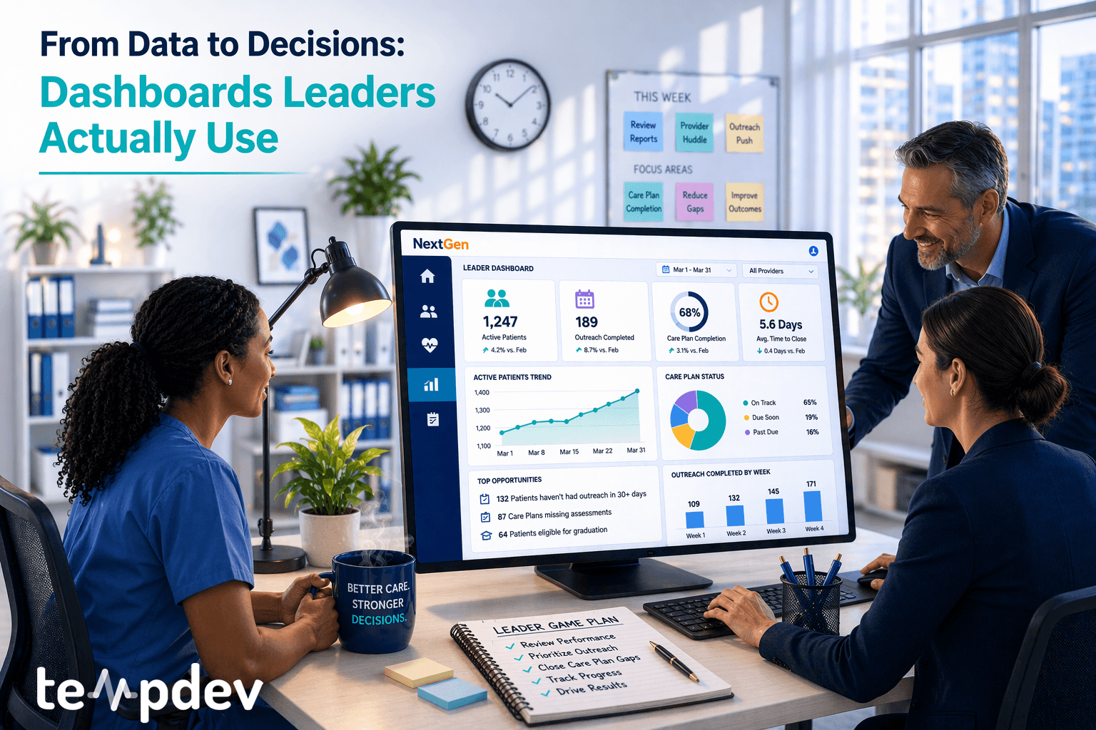
What Effective Healthcare Dashboards Actually Show
A good dashboard answers three questions. Where are we now? Where are we going? What needs my attention?
Here is what that looks like in practice.
Revenue cycle KPIs
Your leadership team needs to see the basics at a glance. Days in accounts receivable. Denial rates by payer. Clean claim percentages. Charge lag. Cash collections compared to targets. When these numbers trend the wrong way, the dashboard should make that obvious.
Operational throughput metrics
How many patients moved through intake yesterday? What is the current wait time for new appointments? Which providers have the highest no-show rates? These metrics help operations managers spot bottlenecks before they become crises.
Care program performance indicators
For organizations running Chronic Care Management (CCM), Enhanced Care Management (ECM), or Principal Care Management (PCM), visibility into enrollment, billing, and patient outcomes is needed. Are your care managers hitting monthly touchpoints? Are claims going out clean?
Healthcare operational analytics should not require a data scientist to interpret. The best dashboards make trends obvious. Red means stop. Green means go. Yellow means look closer.
Designing Role-Based Dashboards for Healthcare Leaders
One dashboard cannot serve everyone. A CEO needs different information than a revenue cycle director. Build for each role.
Executive leadership dashboards
C-suite leaders need the big picture. High-level revenue trends. Overall denial rates by percentage. Patient satisfaction scores. Quality measure performance. They do not need to see every denied claim. They need to know whether the denial rate is improving or getting worse.
Operational manager dashboards
Managers need detail. Which specific payers are denying most frequently? Which providers have the highest number of open referrals? Where is the charge lag coming from? These dashboards should allow drilling down to individual transactions.
Program-level performance dashboards
For CCM, ECM, or PCM programs, managers need visibility into enrollment numbers, monthly billing, and patient engagement. How many patients were billed this month? How many had a clinical touchpoint? Which patients are falling out of compliance?
When you design healthcare executive dashboards this way, each leader sees exactly what they need. No more. No less.
Integrating EHR and Financial Data for Complete Visibility
Here is where most organizations get stuck. Clinical data lives in the EHR. Financial data lives in the practice management system or billing software. Integrating them is hard.
Data integration challenges
Without integration, you cannot answer basic questions. Does a drop in revenue correlate with a drop in patient visits? Are patients with chronic conditions generating more denials? You have the data. It is just in two different places.
Creating consistent KPI definitions
Your finance team defines "days in AR" one way. Your revenue cycle team defines it another way. Neither is wrong. But when definitions differ, trust erodes. Agree on definitions first. Then build the dashboard.
Aligning clinical and financial data
The goal is a single source of truth. One dashboard that shows revenue, volume, quality, and operations side by side. When clinical and financial data align, leaders see the full story.
NextGen reporting dashboards are the natural starting point for organizations already on the platform. Your data is already there. The question is whether you can see it clearly.
How TempDev Converts Reporting Into Business Intelligence

We have spent 18 years inside NextGen, so we know where the data lives and how hard it is to get out.
BI architecture design
We start by understanding what questions your leadership team needs to answer. Then we design a BI architecture that pulls the right data from the right places. No fire hoses. No data dumps. Just the metrics that matter.
NextGen data extraction
NextGen holds massive amounts of clinical and financial data. Extracting it in a usable format requires deep system knowledge. TempDev brings that expertise. We build extracts that feed clean, reliable data into your dashboards.
Executive-level performance dashboards
The final piece is visualization. We build dashboards that leaders actually want to open. Clean layouts. Clear metrics. Real-time or near-real-time updates. No more waiting for monthly report runs.
Our NextGen Order Management BI Dashboard is one example. It pulls order data from across the practice and presents it in a way that drives action. We are applying the same approach to revenue cycle, quality reporting, and operational metrics.
We also regularly write about these topics. Our blog on workflow optimization covers similar ground from a different angle.
Healthcare executive dashboards are not about fancy visuals. They are about clarity. When your leaders can see what is working and what is breaking, they make better decisions. Faster decisions. Decisions that improve revenue, quality, and patient care.
TempDev helps you get there. We convert reporting into business intelligence. We turn data into decisions. And we do it inside the NextGen ecosystem, we know better than anyone.
Ready to stop drowning in static reports? Let us build dashboards that actually get used.
Interested?
Agree with our point of view? Become our client!
Did you enjoy this read? Feel free to share it with your contacts.
